
Case Study: $11.7K to $30.4K Net in One Month, From a Real Dashboard
One creator dashboard, complete and unedited: net revenue up 2.6x in a single month, with 68% of it earned in the DMs. Here is what that category split says about where OnlyFans money really comes from.
Written by Jonathan F. Published Updated Reviewed by the OnModelStudios team Editorial policy
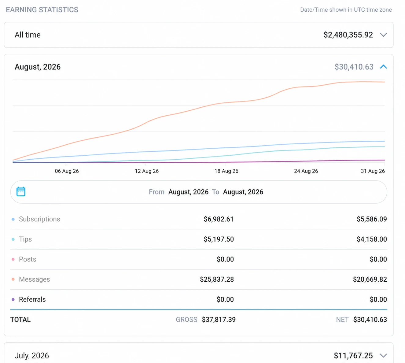
Here is what you are looking at. Below is the complete earning-statistics screen of a creator we manage, with nothing cropped out. The usual OnlyFans case study is one big number with the context trimmed away; this is the reverse. The creator is Sarah, whose video testimonial and full figures are on our results page, and every number in this article can be checked against that screenshot. We claim nothing beyond it.
In this guide
The numbers, unedited
Lifetime, the account has brought in $2,480,355.92. July 2026 netted $11,767.25. August netted $30,410.63 on $37,817.39 gross, which works out to 2.6 times July. And the platform’s own category breakdown for August reads: messages $20,669.82 net, subscriptions $5,586.09, tips $4,158.00, posts $0.00, referrals $0.00. Add those four up and you get $30,413.91, which is $3.28 more than the $30,410.63 the platform prints as the month’s total. The gap is the platform’s, not a typo here: on the same screen its total gross row also reads $200.00 below the sum of its own category gross figures. That $200.00 was a refund posted against the month. It does not explain the $3.28 — a refund netted at 80% would have moved the net total by $160.00, not by three dollars — so that part stays an open question. We publish the total the platform reports rather than our own addition, and we flag the difference instead of quietly picking whichever number reads better.
68% of the month came from the DMs
The messages row is the line that matters most. Of $30,410 net, $20,669 came through conversations, which is 68%: PPV unlocked in chat, customs negotiated in chat, money spent because a real person was present in the inbox when the fan was. For accounts we run that ratio is not unusual; across our roster the average is around 74%. It is the empirical answer to the question every creator asks sooner or later, which is where the money actually comes from. Not the wall. The inbox.
What the two $0 rows mean
Posts: $0.00. Referrals: $0.00. The first instinct is that something must be broken. It is the reverse. Those zeros mean the wall is doing its actual job, which was never to earn directly. It feeds the funnel. Subscriptions ($5,586) bring fans through the door, the feed keeps them warm, and the DMs turn them into revenue. A creator grading her month on post revenue would call this account a failure. The payout disagrees.
The shape of the curve matters as much as the height
Now look at the messages line on the chart. It climbs like a staircase across the whole month, step after step, with no single spike. A viral moment draws a cliff: one enormous day, then flat. Daily selling draws the staircase you see here, and staircases are what come back next month. Spike versus staircase is one of the quickest ways to read any earnings chart someone hands you, ours included.
What we are not claiming here
This is one month, on one account. We show it because we publish real screens rather than multipliers, not because every month looks like this. July was a weak month for this account; you can see that in the same screenshot, and it is part of why August looks so steep. Months swing. The structure does not: the inbox carries the revenue, and covering the inbox is the single biggest operational difference between a managed account and a solo one. If an agency shows you only its best month with the context cropped, our vetting guide tells you what to ask next.
Run the same math on your own numbers
Take last month’s figures from your own dashboard and run them through the earnings calculator to get your category split. Then use the commission calculator to see how much management would need to add before it pays for itself. If your messages row is under 50% of net, that gap is usually where the opportunity sits, and it is exactly the part a chat team covers. The full dashboard, next to a second creator’s, is on the results page.